Case Study
Candidly Design System
Breaking Through After Three Failed Attempts
// 01 — overview
Overview
After three failed design system attempts, Candidly hired me to finally solve the adoption problem. I rebuilt the system from the ground up using a two-level semantic token architecture, comprehensive documentation, and sustained ownership—enabling 100% platform adoption and winning a major banking client through white-label capabilities.
Key Results
Platform adoption of semantic tokens
Pages using reusable components
Hard-coded values eliminated
Major client won through white-label capabilities
// 02 — problem
The Problem
Original color palette showing limited structure
When I joined Candidly in November 2023, the design system had stalled. Three previous attempts had failed to gain adoption, leaving the product in technical debt:
- •1,000+ hard-coded color values scattered across the codebase
- •Multiple duplicate components (4-5 radio button variants with inconsistent behavior)
- •Arbitrary design values (10+ different border radius options)
- •No systematic approach to colors, spacing, or components
- •Zero ownership to drive adoption and maintain momentum
Why This Mattered
Enterprise clients expected white-label capabilities. We couldn't deliver. When prospects asked about customization, the answer was "maybe, but significant custom development required."
The business impact was real.
// 03 — role
My Role
I was brought in specifically to break through this plateau—not just build another system, but ensure it would actually be adopted.
What I Did
Guardian & Owner
Sustained momentum over two years, making decisions and pushing through resistance
Strategic Architect
Designed two-level token system optimized for adoption over theoretical perfection
Educator & Collaborator
Weekly team sessions, comprehensive documentation, proved value through concrete examples
Implementer
Audited platform, built token architecture, consolidated components, drove migration
// 04 — research
Research & Approach
Data-Driven Audit
I used Chrome DevTools to document every design value across the platform—border radii, colors, spacing, typography. The goal: understand actual usage patterns to make defensible consolidation decisions.
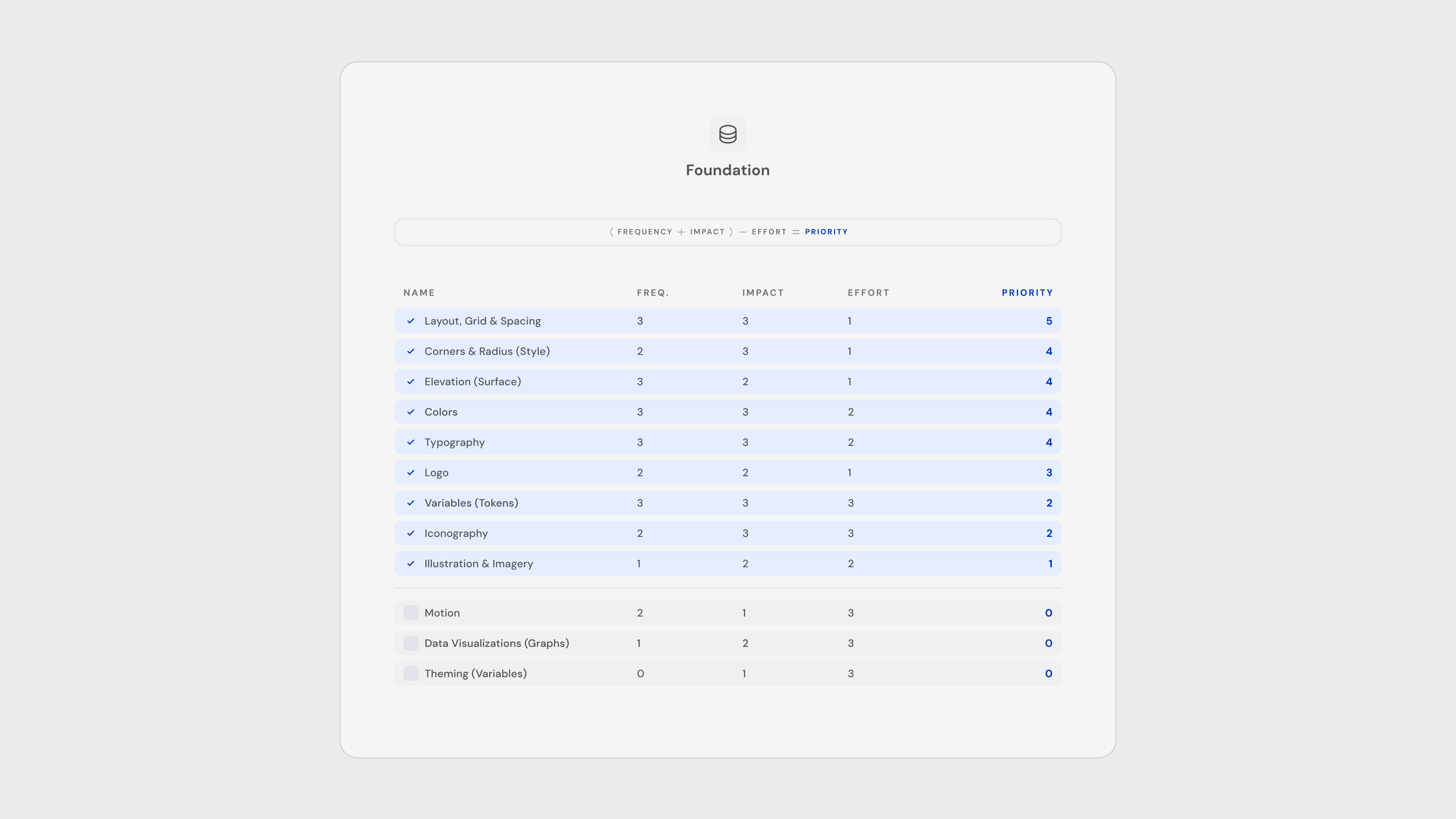
Foundation Priority Tackle Order Sheet - (Frequency + Impact) - Effort = Priority
What I Found:
- • Border radius had 10+ arbitrary values that could consolidate to 4-5 systematic values
- • Official brand colors were ignored—designers created unauthorized variations
- • Support colors failed WCAG accessibility standards
- • No consistent spacing scale
The data removed subjectivity. Consolidating 7, 8, 10 into 8 wasn't about my preference—it was about usage patterns and creating a predictable 4/8 grid system.
Strategic Decision: Two-Level Semantic Tokens
After studying industry systems (Adobe Spectrum, Atlassian, IBM Carbon), I made a critical architectural choice: two-level semantic tokens, explicitly avoiding component-level complexity.
Why?
Previous attempts failed because they were too complex. Given our startup constraints and adoption history, simpler was more likely to succeed.

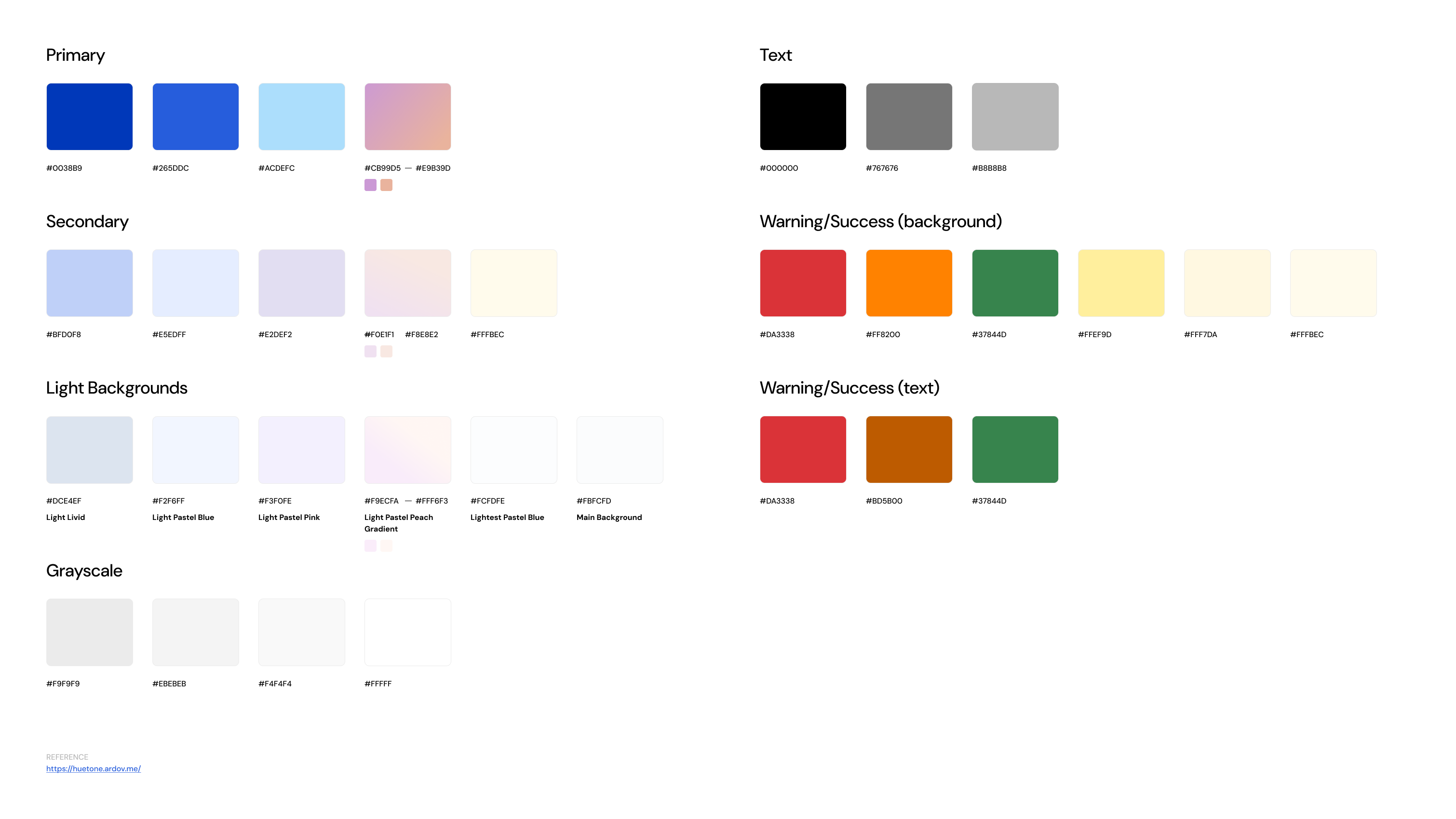
Color and typography documentation showing primitives and semantic tokens
How It Works:
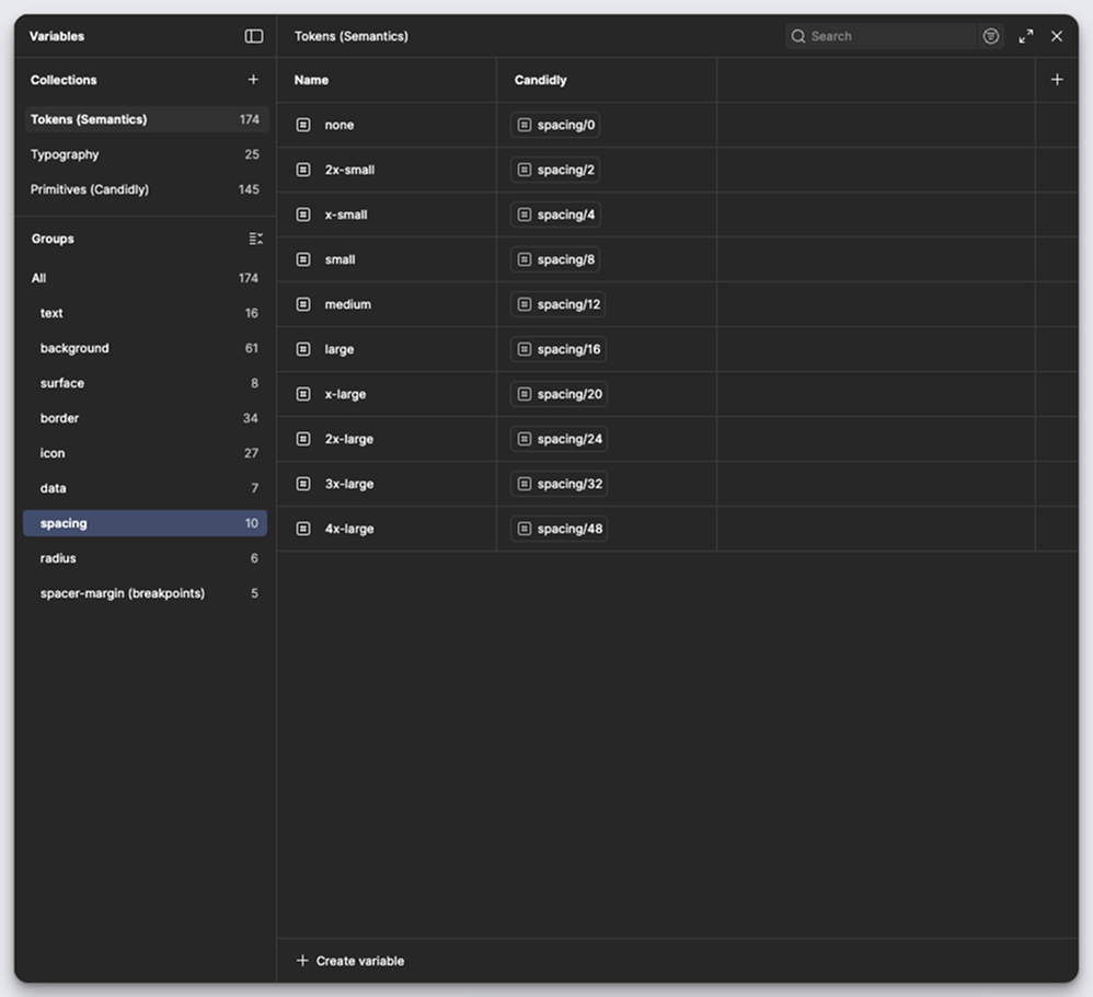
Foundation Layer (~120 tokens)
- • Raw values: HEX colors, pixel sizes, font weights
- • Organized into scales:
blue.10→blue.90,spacing.xs→spacing.xl - • 23 spacing tokens, rest primarily color
- • Used Tailwind CSS for support colors (pragmatic efficiency)
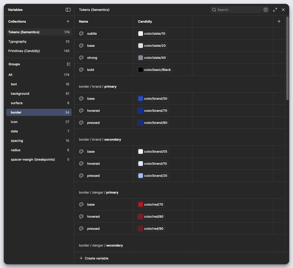
Semantic Layer (~170 tokens)
- • Usage-based tokens:
background.brand.primary.base,text.subtle,icon.danger - • Named by function, not appearance
- • 20 spacing-related tokens, rest primarily color
- • Self-documenting: even non-designers understand
icon.brand.primary
Why This Enables White-Label
The semantic layer acts as a mapping interface between primitives and UI.
icon.brand.primary → points to blue.50 (Candidly default)
icon.brand.primary → points to client.red.50 (Client brand)
Same token name. Different primitive. Zero code changes.
We can change the visual perspective without changing the structure—exactly what enterprise clients need.
// 05 — building
Building the System
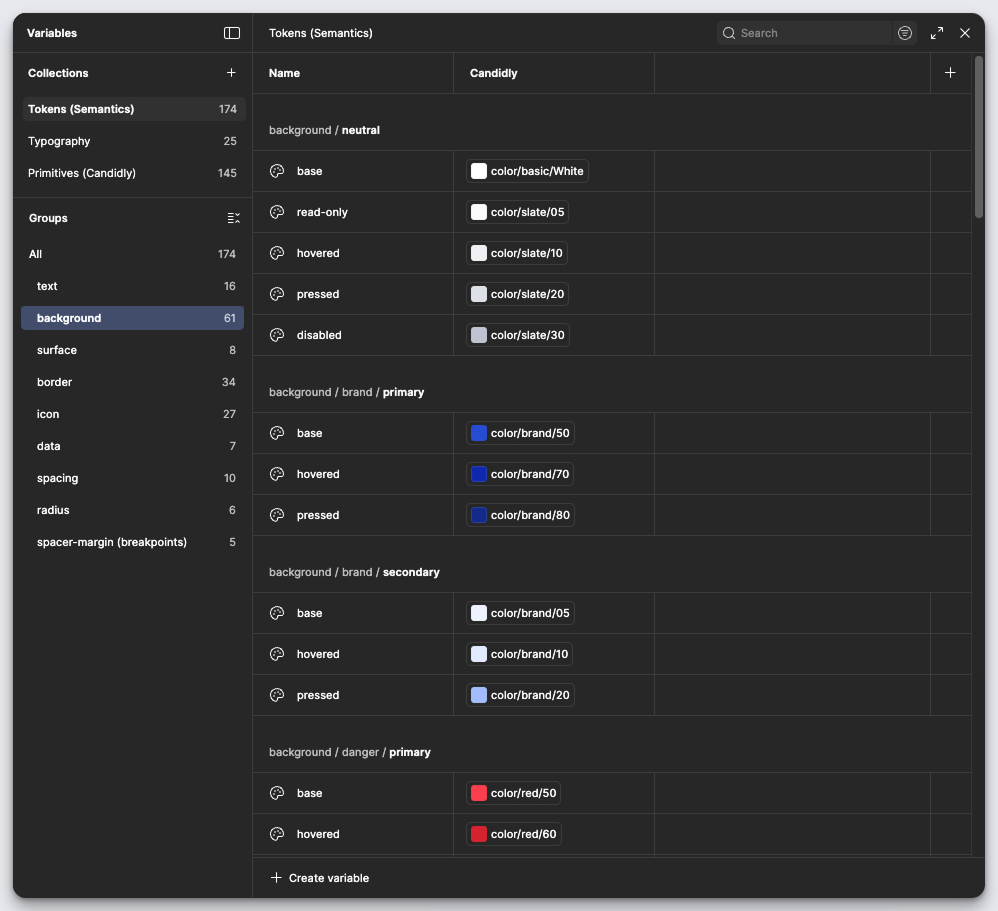
Figma variables showing semantic tokens for backgrounds, borders, and spacing
Token Architecture Implementation
December 2023 - March 2024
Built the system in layers:
- Foundation primitives with consistent scales
- Semantic tokens with clear naming conventions
- T-shirt sizing for intuitive use (xs, sm, md, lg, xl for radius)
- Comprehensive documentation for every element
Strategic Constraints
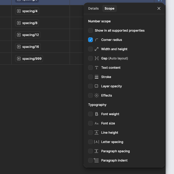
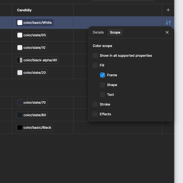
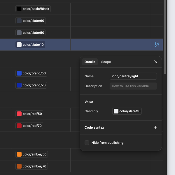
Figma token scoping: Corner radius, Frame backgrounds, Token naming, and Text color constraints
I added Figma scoping to tokens—background tokens only appear for fills, border tokens only for strokes, radius tokens only in radius fields.
The system prevents errors automatically. Designers can't misuse tokens even if they try. This removes cognitive load and maintains consistency without requiring constant vigilance.
Component Consolidation
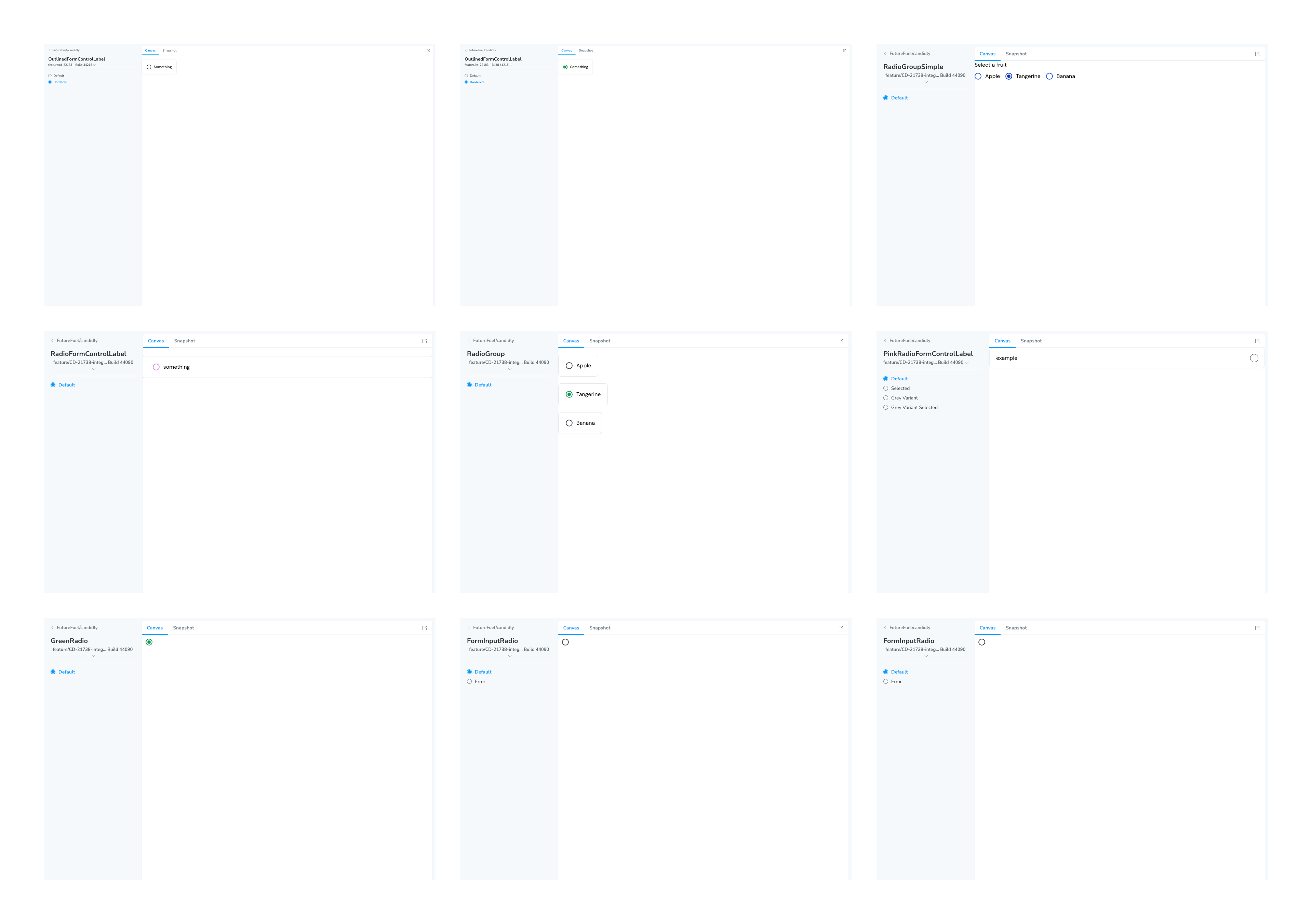
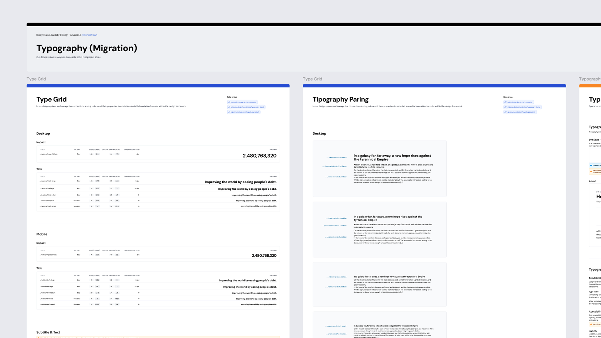
Component exploration in Storybook: Radio button variants (left) and Alert components (right)
For every component I added, I removed 3-4 duplicates. Radio buttons went from 4-5 inconsistent variants (one even behaved like a checkbox despite its appearance) to one properly functioning system.
Quality over quantity. Every component had to justify its existence.
Documentation as Foundation
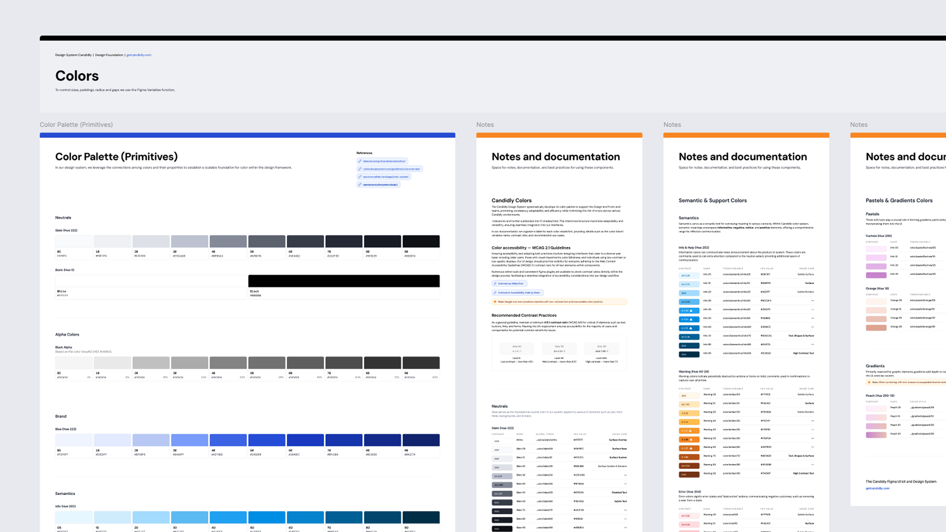

Comprehensive color and typography documentation with usage guidelines
Previous attempts failed partly due to lack of documentation. I treated documentation as essential:
- • Usage guidelines for every token
- • Visual examples and accessibility notes
- • Technical specifications for implementation
- • Foundations file as single source of truth
Migration Phase
April - May 2024
Working sessions with design and dev teams to systematically replace every hard-coded value. Every page, every component, every instance reviewed.
By May 2024: 100% platform adoption achieved.
// 06 — adoption
Driving Adoption
The Critical Difference
Building systems is easy. Getting people to use them is hard.
What I Did Differently:
Weekly Alignment
Working sessions (not presentations) where the team shaped decisions together
Education Over Enforcement
Showed consequences of working outside the system vs. benefits of using it
Empowered Non-Designers
Token naming so clear that QA could catch design issues, developers gained autonomy
Acted as My Own PM
Prioritized work, communicated progress, made tactical decisions without direct PM support
The Turning Point
Adoption was gradual, then accelerated. By the migration phase, people wanted to use the system because they'd seen it work. Not mandated—chosen.
Why this succeeded where three previous attempts failed:
- • Sustained ownership (someone dedicated to maintaining momentum)
- • Strategic simplicity (learnable in days, not weeks)
- • Documentation and examples (comprehensive guidance)
- • Data-driven decisions (defensible consolidations)
- • Team collaboration (made it "ours" not "mine")
// 07 — impact
Impact
Business: Major Client Win
Second half of 2024: A major U.S. banking client required white-label capabilities for our platform.
The Challenge:
Their multi-level token system didn't map directly to ours. Different component hierarchies, more variants, different color applications.
The Solution:
Semantic token architecture made it possible. We remapped primitives without touching components or implementation—icon.brand.primary just pointed to their red instead of our blue.
Project took ~6 months (mostly approval cycles), but my work moved quickly because the architecture was designed for this.
We closed the contract. The client specifically cited white-label capabilities as a deciding factor.
The design system work directly enabled revenue.
Technical Achievements
| Metric | Result |
|---|---|
| Token adoption | 100% across platform |
| Component reusability | 80% on most pages |
| Hard-coded values removed | 1,000+ eliminated |
| Total tokens | ~290 (120 primitives, 170 semantic) |
| Accessibility | WCAG-compliant by default |
User Experience Impact
Consistency Improved Discoverability
Same patterns everywhere—users build mental models faster
Reduced Cognitive Load
Predictable visual language—less energy decoding interface
Predictable Interactions
Radio buttons behave like radio buttons everywhere—builds trust
Team Impact
Development Velocity Increased
Hours of custom code → Minutes with reusable components
Design Efficiency Gained
Clear guidelines and reusable components reduced design time significantly