Case Study
Semantic Tokens: Building a Scalable Design Foundation
How I rebuilt Candidly's design system from raw HEX colors into a two-level semantic token architecture.
TL;DR
Rebuilding the design system for scale and automation
I redesigned Candidly's design system from raw HEX values into a two-level semantic token architecture. This unified design and code, removed over 1,000 hard-coded color references, improved accessibility, and prepared the system for AI-driven automation and multi-brand scalability.
.png)
The Challenge
Inconsistent color values slowed everyone down
When I joined Candidly, our design system relied on raw HEX values and inconsistent naming — things like candidly/blue or gray/medium.
- DESIGNERS LACKED FLEXIBILITY
- DEVELOPERS LACKED CLARITY, AND
- SMALL UPDATES TURNED INTO FRICTION POINTS
- LACK OF NAMING CONVENTION
The Goal
Create a scalable system that empowers both sides
I set out to design a token framework that would:
The Approach
Building a two-level token architecture
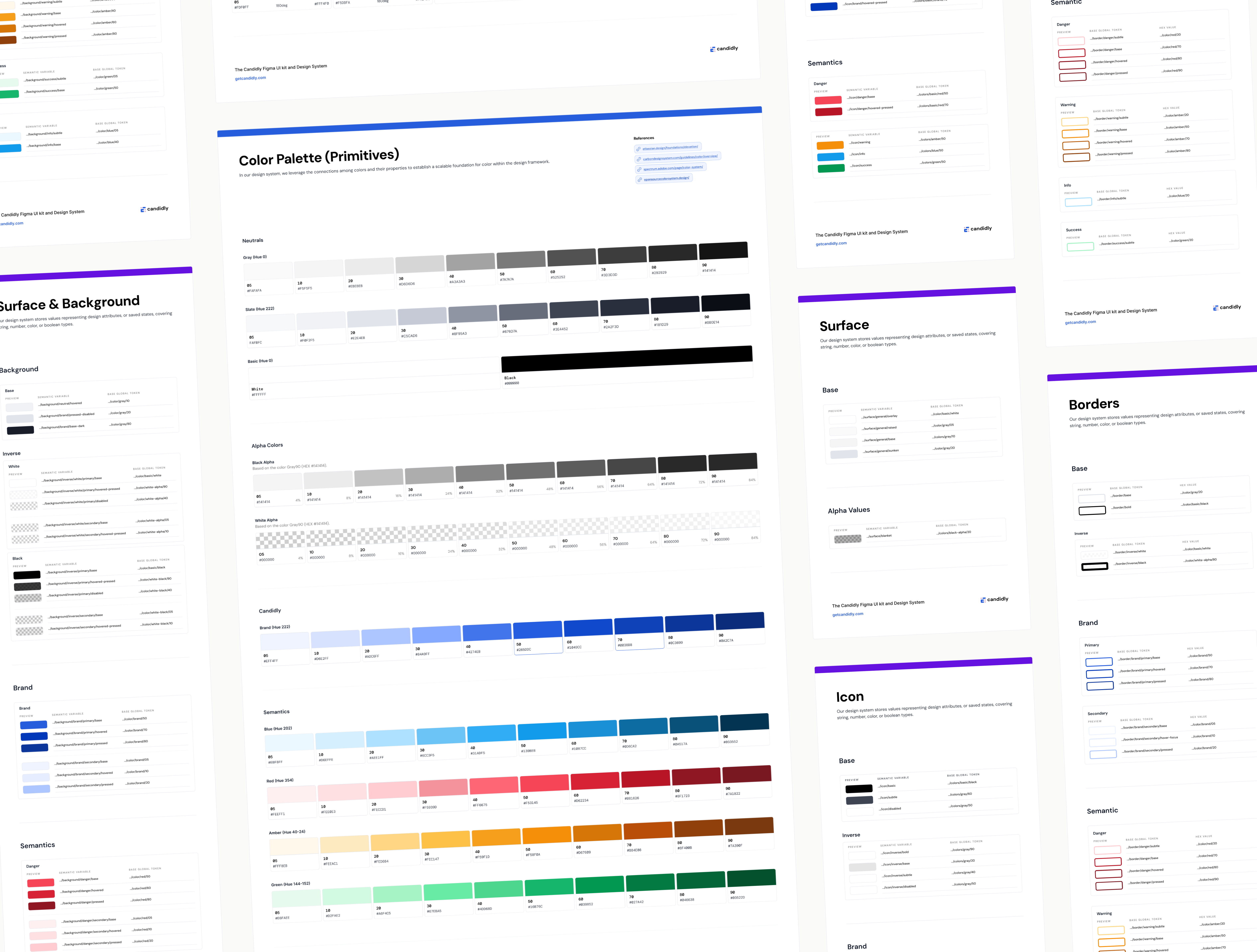
With limited resources, I kept it lean but strategic. I studied token frameworks from Adobe, Atlassian, and Tailwind, extracting the best parts to build our own two-tier model:
Usage Variables scoped tokens visibility in Figma
For example, background tokens are only available for frames, border tokens for strokes, etc. This made the system clear, usable, and harder to misuse.
Foundational tokens (primitives)
Link to raw HEX values
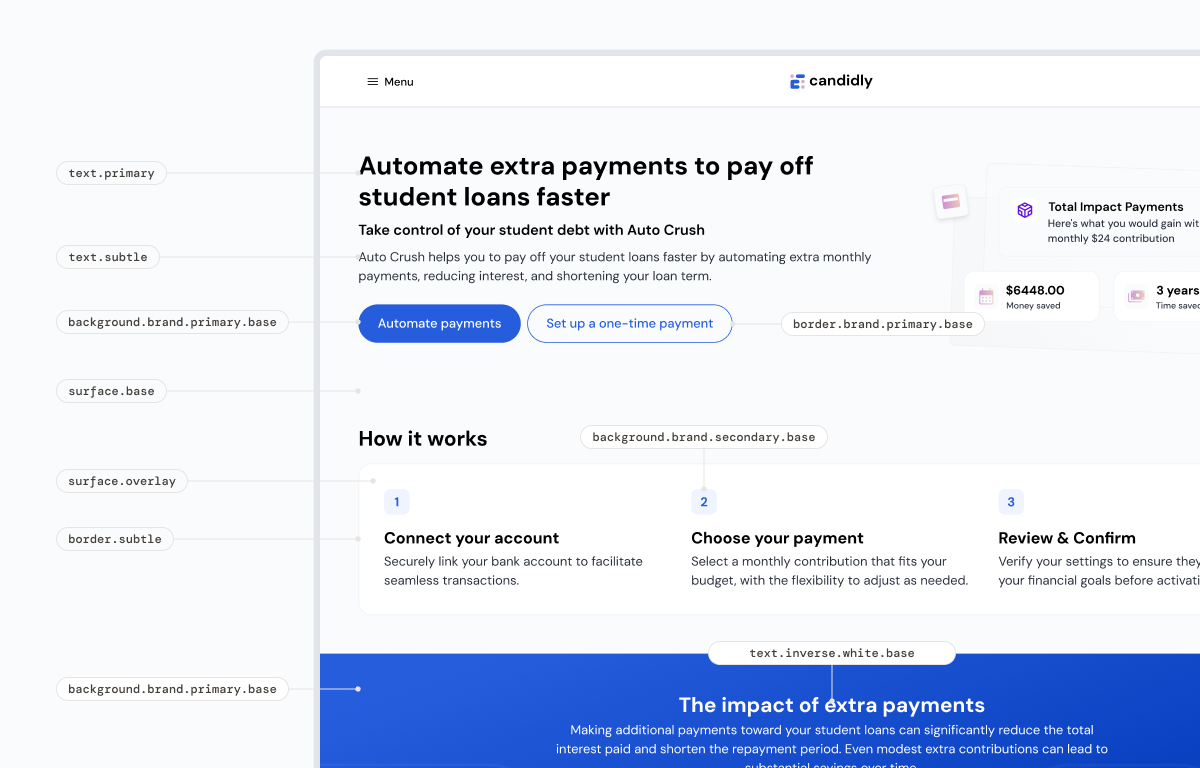
Semantic tokens
Tokens describe its functional intent, each part name its usage.
Team Rollout
Gradual adoption through collaboration
We rolled out the tokens step by step, running naming workshops and usability exercises with designers and developers. Weekly syncs helped refine semantics for states like danger, success, and info.
Collaborative Refinement
Continuously weekly sessions with designers and developers to refine naming convention and usage until everything felt natural and standardized.
Expanded the token system to cover multiple design elements
Unified Foundation
Each new layer built toward a flexible, scalable foundation that the entire team could leverage.
Impact
A flexible, future-ready design foundation
Removed over 1,000 primitive references from code
Achieved AA (4.5:1) and 3:1 contrast ratios across UI
Reflection
Constraints can unlock creativity
By connecting Figma and code through semantic structure, we transformed our design system into an adaptable, evolving ecosystem. This project didn’t just improve efficiency, it became the foundation for how we now design, scale, and explore automation at Candidly.
BACK TO HOME