Playground · UX-Led Prototype
A booking experience built for pet-training schools — worn by any brand
A big dog-training school near me books through a CrossFit app. Generic tools exist, but few fit this fast-growing niche — so I designed the booking experience it's missing, and built it white-label: one build, any brand.
A high-fidelity, navigable prototype — no database, demo data in memory. The point is the product thinking and the experience, not a transactional backend (an honest next step). The full reasoning lives in a tracked decision log.
The real prototype, running here. Tap the palette in the app header to switch brand — the booking you just made stays put.
Open in a new tab// 01 — the gap
The gap: a niche making do with the wrong tools
It started with one observation in Braga: a large dog-training school runs its bookings inside Regybox, a tool built for CrossFit gyms. The pain isn't cosmetic; it's a context mismatch. The app says "senhas" (gym tokens), shows an unlabeled LCD WOD countdown, and renders English day headers inside a Portuguese app. A dog class, living inside a gym tool — and the spark for this whole project.
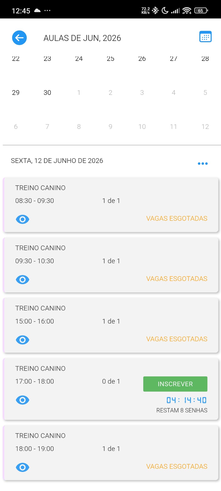
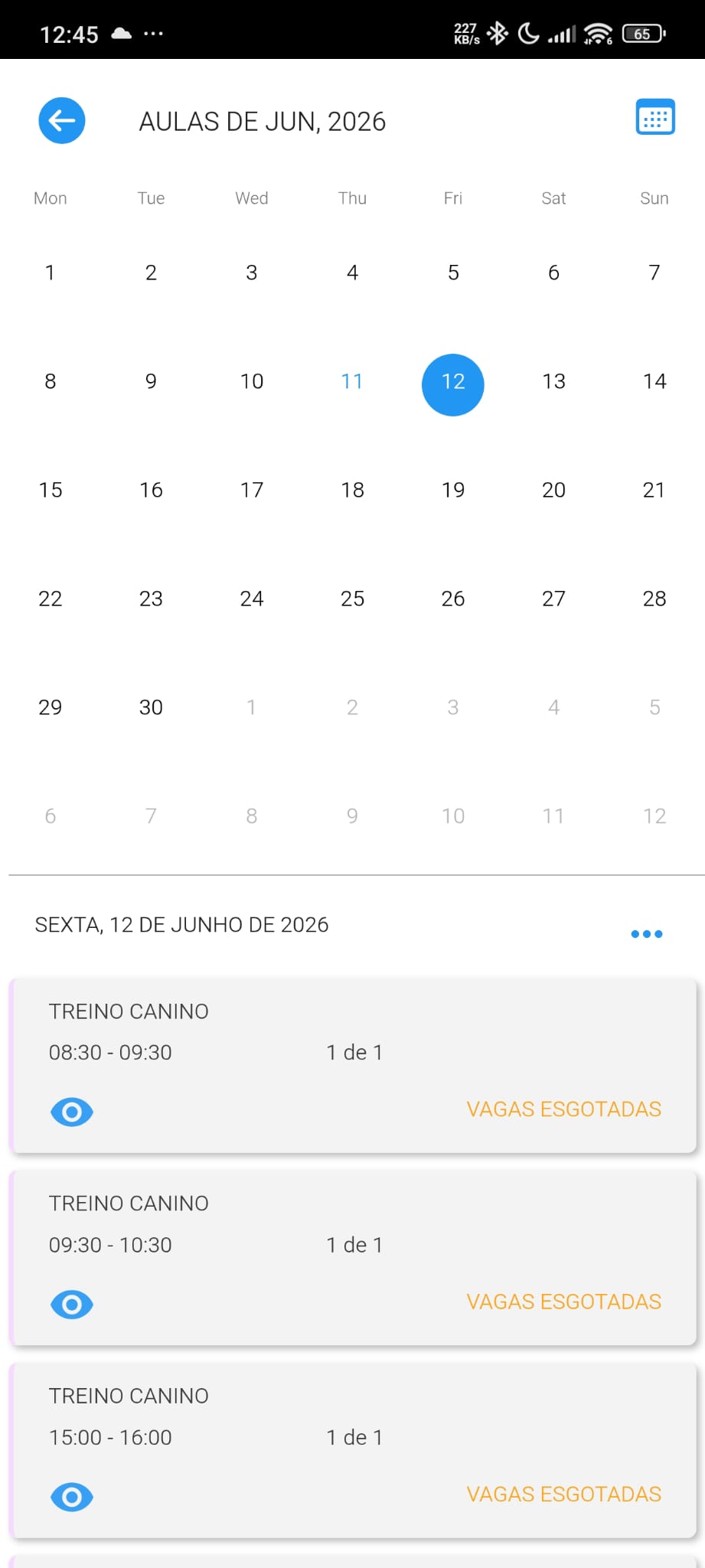
The anchor image: a dog school wearing CrossFit chrome. "8 tokens left", a WOD timer, the wrong vocabulary throughout.
Booking tools obviously exist — Smoobu, Anolla and others handle reservations well. But they're general-purpose, not shaped for how a pet-training school works: levels, recurring classes, waitlists, the owner who's never at a desk. With the pet market large and growing, that's a real, underserved niche — not an empty category, just one nobody has tailored for.
Generic booking apps
Smoobu, Anolla & co. book fine — but aren't shaped for levels, recurring classes, or the waitlist a school lives on
Gym tools & WhatsApp
What schools actually reach for: fitness software bent out of shape, or a chat thread with no capacity or state
The opening
The structured-but-simple middle, tailored to the niche — that's the gap worth filling
// 02 — discover
Discover — is there a market, and is the pain real?
Before designing a screen, I sized the opportunity and grounded the pain in evidence. Claude helped me structure the market analysis and a heuristic evaluation with sources.
~3M
dogs in Portugal
~38%
of households have a dog
97%
are smartphone-first
98%
coordinate via WhatsApp
The read: a small, non-technical, mobile-first buyer — exactly the profile gym tools serve badly. And the real competitor turned out to be WhatsApp. The gap to win is the structured-but-simple middle: as easy as a message, with the capacity, waitlist and reminders a message can't give.
The thesis, in one line
The best booking experience for pet-training schools — as simple as a WhatsApp, with the structure WhatsApp lacks — and one any school can wear with its own brand.
Honesty of method: a one-evaluator heuristic review, client-side only — declared, not inflated.
// 03 — solution
Solution — from real people to features
The six personas are a synthesis of real conversations with dog owners I know — not hypotheses to test. They exist to stretch the design across beginner↔advanced, low-tech↔competition, one↔many dogs. Every feature is traceable to a pain.
| Persona | Pain | Product treatment |
|---|---|---|
| Sofia — Anxious beginner | “I’m never sure my booking actually went through” | Explicit, persistent confirmation (not a toast that vanishes) + a reminder |
| João — Traditionalist | Wants less on screen; distrusts apps | Only two surfaces; book in one tap; zero fields on the happy path |
| Rita — Enthusiast | “I lose spots because I’m not always watching my phone” | Visible waitlist position + automatic promotion and notification |
| Rui — Busy | Forgets the class; has cancelled by accident | Fast happy path + reminder + undo on cancel |
| Carla — Competitor | Wants to separate by discipline / level | Level filter in discovery (level is what defines the class) |
The insight that organizes the product
Opaque state is the #1 pain — 4 of 6 personas. So state clarity isn't a screen; it's the principle running through every surface. It's the direct antidote to Regybox's opacity, and it's the shared core the prototype demonstrates.
Two surfaces, one loop
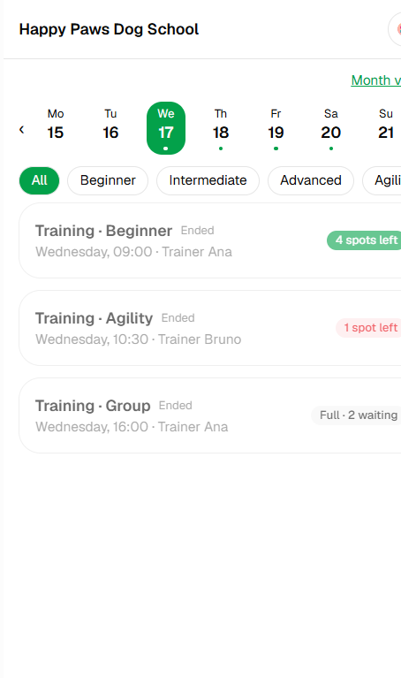
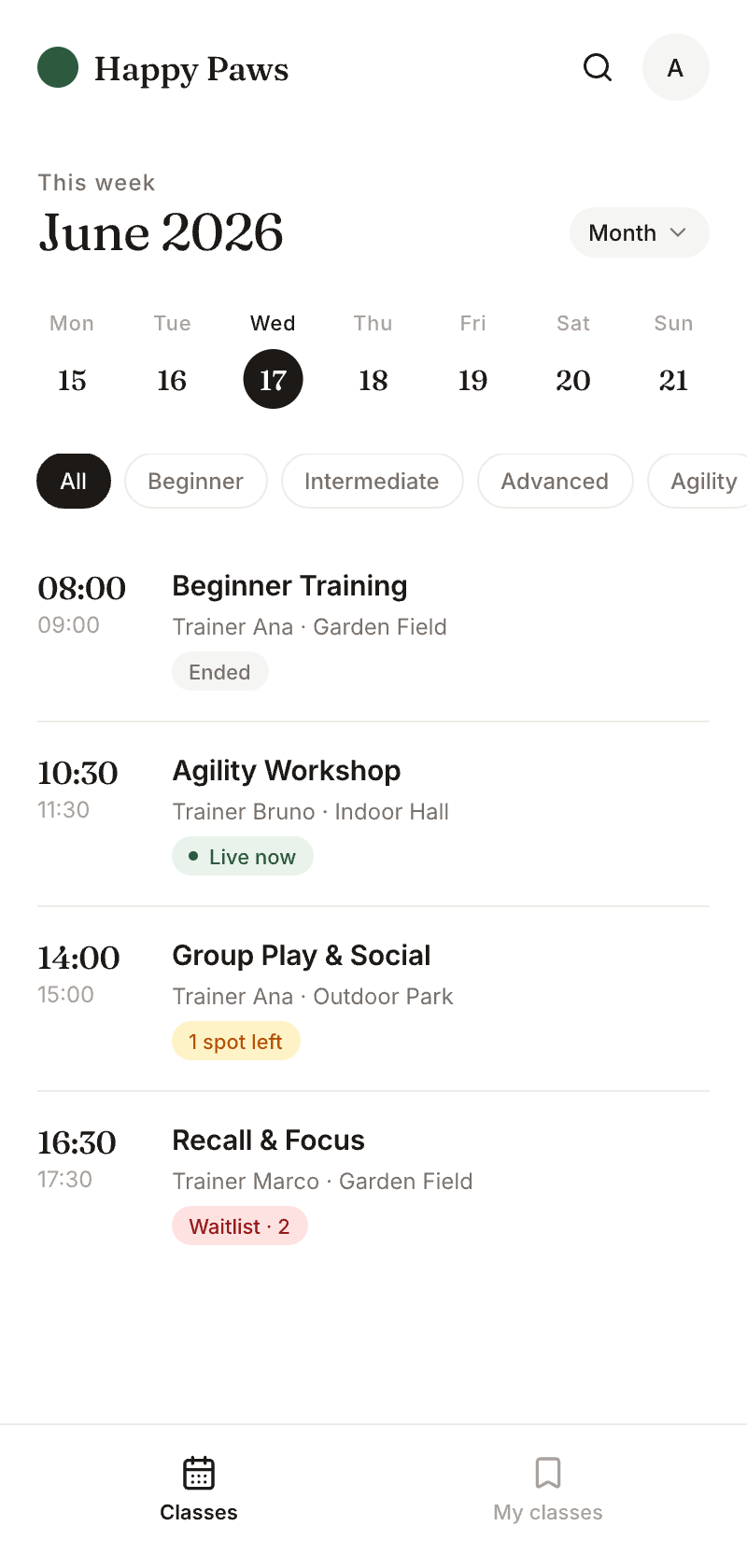
Classes — discovery
Week-strip + month view + level filter. Find the right class fast.
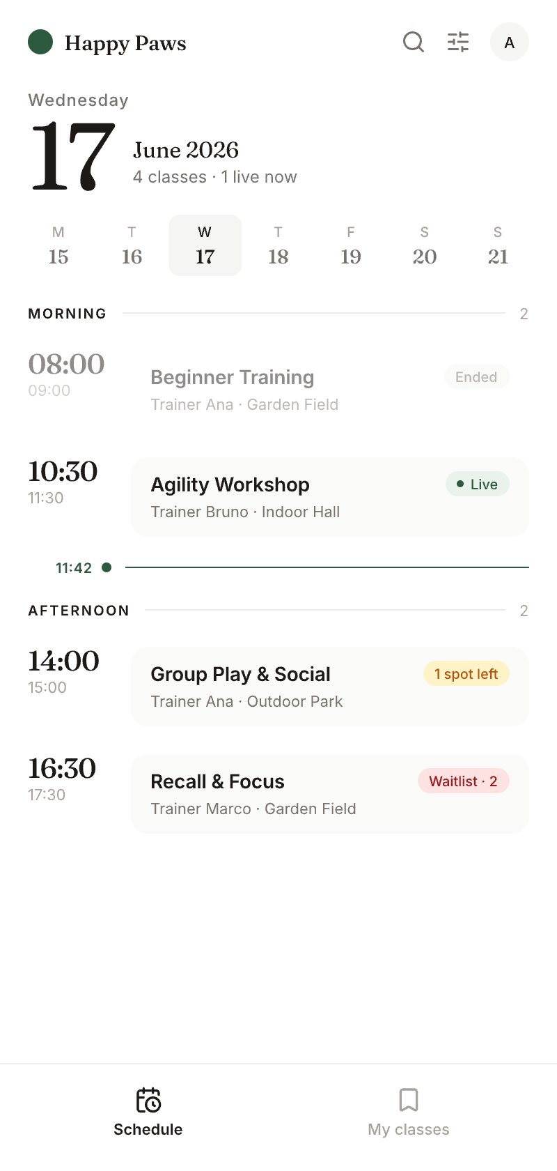
My classes — state & control
Next class highlighted, waitlist position, cancel deadline, undo. The home of state clarity.
A dual-function bottom sheet carries the loop: a summary becomes the success state in place — "You're booked · Sat 10am". When a class is full, the same sheet offers "Join the waitlist · position 2". Cancel inside the window (with undo); outside it, the action is disabled with the reason shown.
What I chose not to build
The per-booking dog selector, a transactional backend, and a second vertical all came out of scope. Discipline is the argument here: one niche done very well, plus a live white-label proof, beats three half-proofs. The real engine and the trainer-side surface are honest next steps — not unmet MVP promises.
// 04 — white-label
The payoff — white-label, live
An icon button in the header swaps the brand: Happy Paws → K9 Pro Academy → Au-Au Club. The app re-skins instantly — color, radius, typography, name — and the bookings stay put. That persistence is the proof: it's one build, not three apps. Any pet-training school could adopt it as its own.

Happy Paws
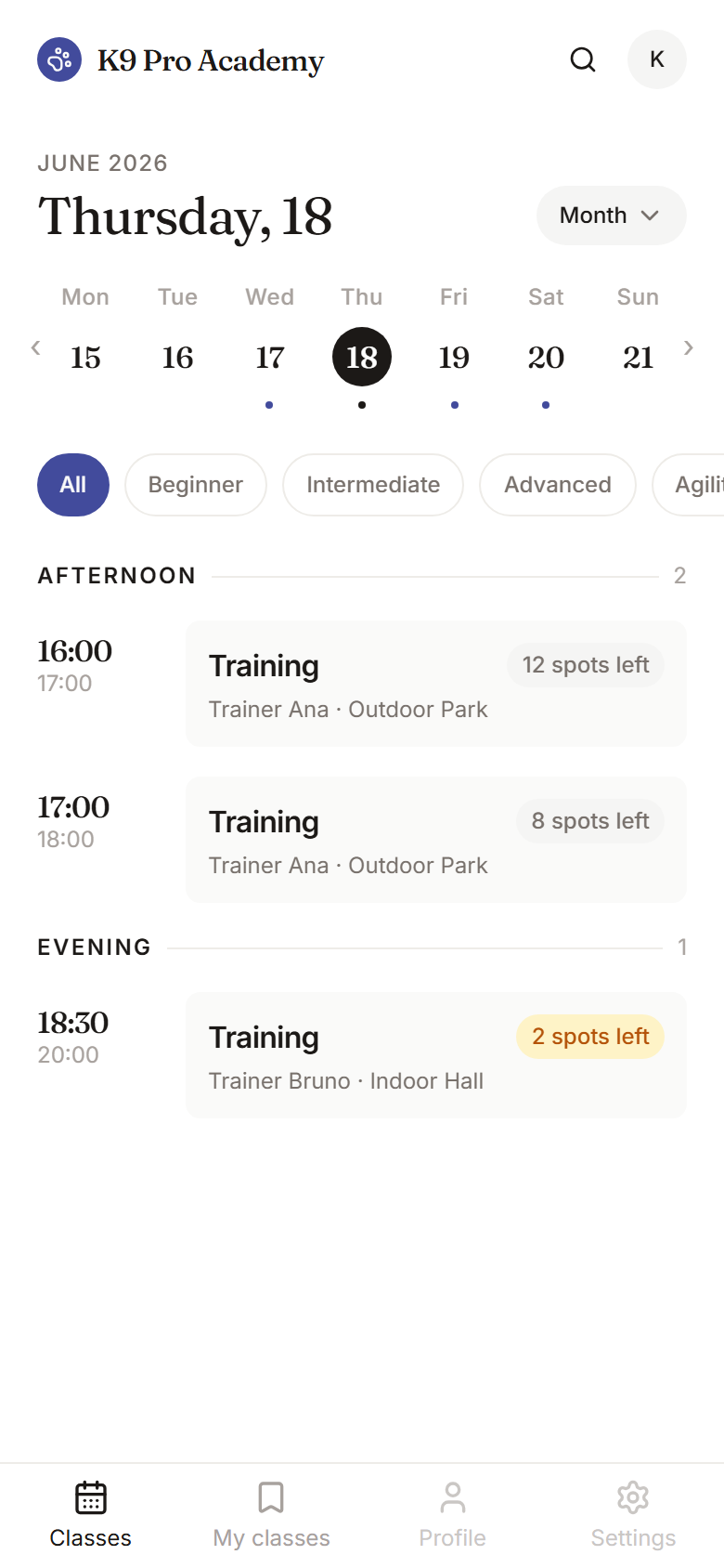
K9 Pro Academy
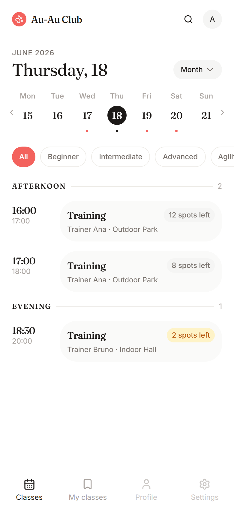
Au-Au Club
One layout, three skins, the same data. Try the palette button in the live app above to see it switch.
// 05 — craft
Craft — polishing the UI in Pencil
The honest prototype already served the personas; the Classes tab was a flat list of cards — functional, unpolished. I ran a round of UI craft in Pencil — effectively a Figma with an agent inside, with one difference that mattered here: the design file (booking-design.pen) lives inside the repository and reads the app's real domain and seed. The design reflects real data, not invented mockups — closing the code ↔ design ↔ code loop.
Before → target
Before — flat card list
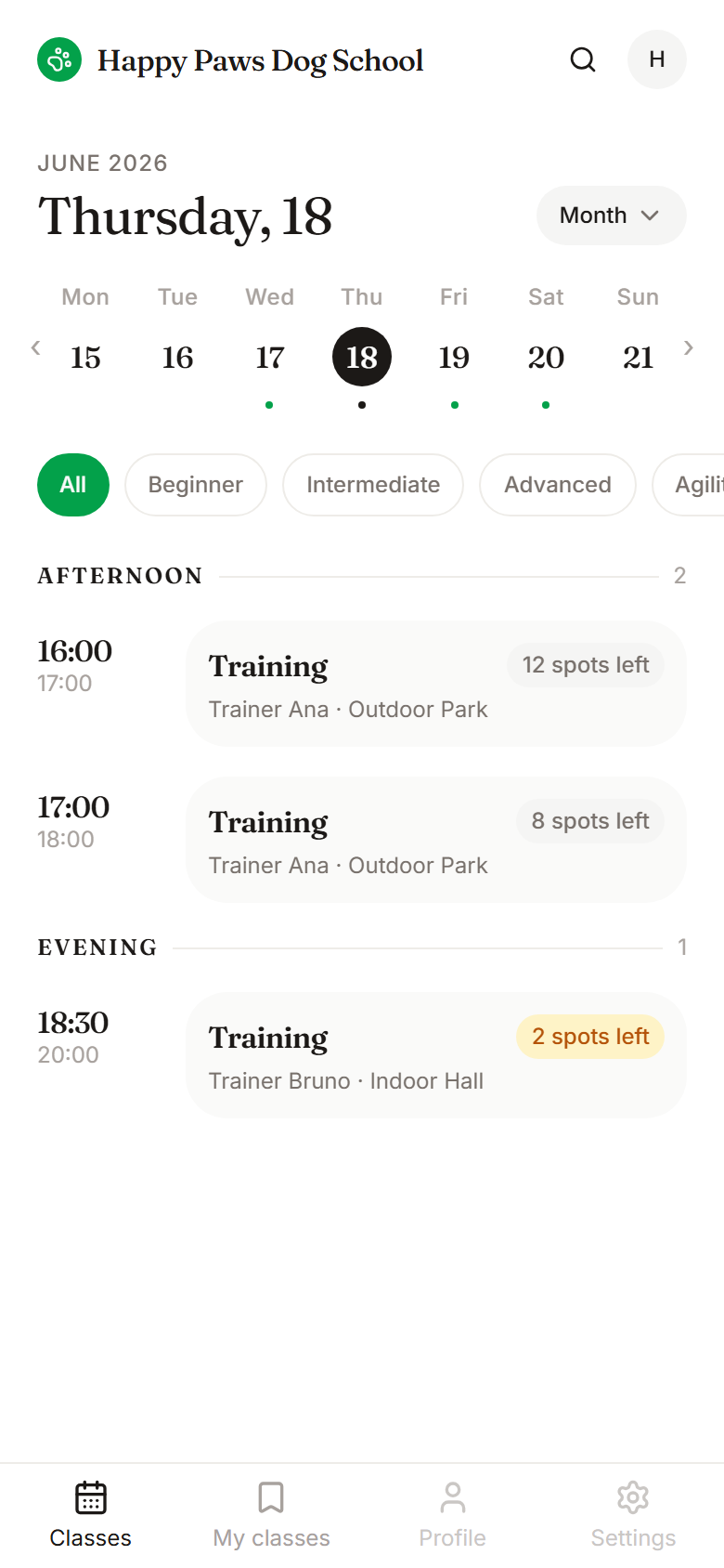
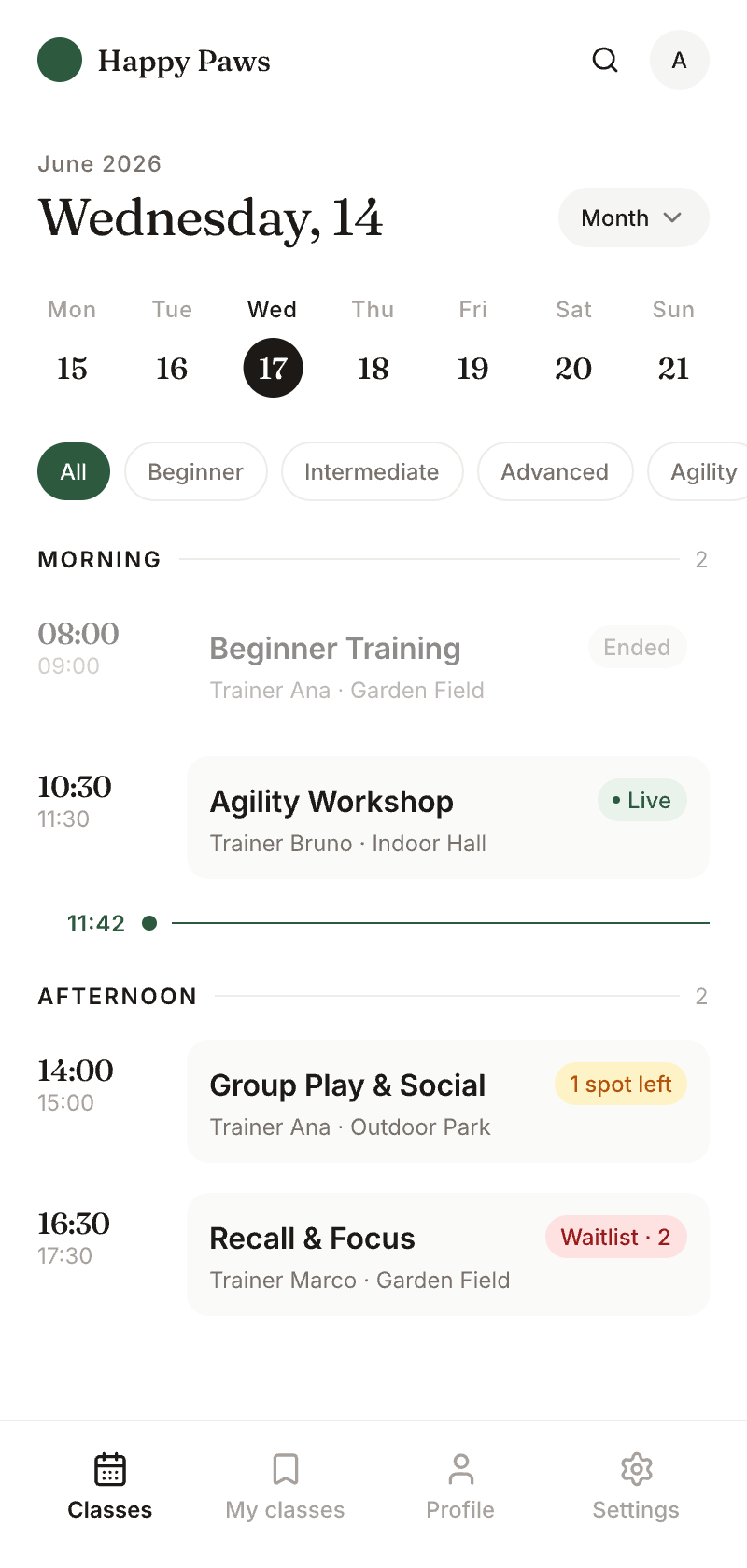
After — agenda-timeline, in code
The target: an agenda-timeline grouped by Morning / Afternoon, a date-indicator, circular week-strip chips, a time-gutter, a "now" line, a four-tab bottom nav, and a Fraunces + Inter type pairing over warm stone neutrals.
Exploration → handoff
v1 · minimal
v2 · timeline
v3 · target
Rather than "implement the mockup", I wrote a handoff plan that maps each design node to an existing component (restyle vs. rebuild), flags what's 100% new (date-indicator, period dividers, now-line), and lists the data gaps (end time, location) before touching code. The redesign is now built into the app — and it still passes the white-label test.
Why it counts: craft with a method, not just "it looks nice" — exploration → comparison → a traceable handoff, with the design coupled to the product so there's no drift between mockup and code.
// 06 — process
Process & tools
Designer-led end to end: discovery and product reasoning, the UX, and a real, navigable build.
01
Claude
Discovery & product
Market sizing, heuristic structure, the decision log, scope pressure-testing — and a build pair.
02
Pencil
UI craft
Design coupled to the repo: the .pen reads the app's real domain and seed.
03
Next.js + shadcn
Build
TypeScript, Tailwind, Zustand for state. Domain logic kept pure and testable.
04
Vitest + Vercel
Verify & ship
The booking logic — capacity, enrol/cancel windows, waitlist — kept pure and unit-tested. Live on Vercel.
// 07 — reflection
What this demonstrates
Discovery
Finding a category that doesn't exist, with evidence — market, heuristic, behavior.
Synthesis
Turning real conversations into personas that stretch the design.
Derivation
Every feature traceable to a pain — product, not decoration.
Scope judgment
Knowing what not to build; a decision log as proof of thinking.
Honesty
Declaring the limits and the honest next step instead of inflating.
The honest next step
A real transactional engine (capacity under concurrency, DB-backed waitlist promotion), a trainer-side surface where the dog's profile is actually consumed, and onboarding. The conceptual data model is already there; turning it into a correct engine is a different competence — and a clear, honest roadmap.
The differentiator was never the skin — it was the product that serves the niche, that every school wears as its own. I proved it by designing the experience first.